The chill wind whipping off the Hudson, catching the corner of my eye as I framed a shot down a sun-drenched Tribeca street – that’s the kind of moment that fuels my creative fire. Lately, I've been obsessed with bringing a specific kind of warmth, a lived-in authenticity, to my digital images. It’s not just about snapping a picture; it’s about crafting a feeling, a memory, that transports you. And for me, that feeling has been decidedly 70s. Think muted tones, a touch of grit, and that unmistakable cyan shift that just screams "vintage film." Today, I’m pulling back the curtain on how I achieve that look, taking you through the precise steps I use to transform a modern digital capture into a timeless, retro masterpiece, perfect for our incredible models here at Dante's.
The Starting Point: A Raw, Flat Image
Every great transformation begins with a solid foundation, and in photography, that means a raw, unedited file straight out of the camera. For this particular shot, we were working in Dumbo, Brooklyn, right by the iconic Manhattan Bridge archway, capturing one of our rising stars, Isabella, in a beautifully tailored retro-inspired outfit. My goal was to leverage the natural, diffused light bouncing off the cobblestones and brickwork.
When I pull that initial raw file into my editing software – usually Adobe Lightroom Classic – it looks… well, flat. It’s almost aggressively neutral, lacking contrast, vibrancy, and any real character. This is by design. A raw file holds the maximum amount of image data, giving me the ultimate flexibility to push and pull colors, recover highlights, and lift shadows without introducing nasty artifacts. Think of it as a blank canvas, ready for me to imbue it with the soul of a bygone era.
My first quick assessment is always about the overall exposure and the general color cast. Is it too dark? Too bright? Does it lean green from fluorescent streetlights or yellow from indoor lamps? In this Dumbo scenario, with open daylight, the color cast was relatively neutral, but the image definitely needed a kick to bring it to life before any creative grading began.
Initial Adjustments: White Balance and Exposure
Before I even think about that delicious cyan, I get the fundamentals locked down. The most crucial initial steps are setting the white balance and fine-tuning the exposure. These aren't creative choices at this stage; they're corrective ones, ensuring that the colors are true to life before I start bending them to my will.
For white balance, I usually start with the eyedropper tool, clicking on a neutral grey area in the image – perhaps a patch of concrete or a grey wall in the background. If there isn't a clear neutral, I’ll toggle through the preset white balances (Daylight, Cloudy, Shade) to find one that looks most natural, then fine-tune it with the Temp and Tint sliders. For Isabella’s Dumbo shot, I opted for a slightly warmer white balance than the camera's auto setting, pushing the Temp slider just a hair to the right, to counteract the cool blue tones that often appear in open shade. This subtle warmth sets the stage for a more inviting, vintage feel without being overtly sepia.
Next comes exposure. I'm looking to get the histogram sitting nicely in the middle, avoiding clipped highlights or crushed shadows. I'll adjust the main Exposure slider first, then use the Highlights and Shadows sliders to recover detail where necessary. For a vintage look, I often lean towards slightly underexposing the image, then lifting the shadows a bit more than usual. This creates a softer contrast, reminiscent of older film stocks. I also tend to pull down the Whites slider slightly and push up the Blacks, which compresses the dynamic range just enough to give it that gentle, faded filmic quality without losing crucial detail. I'm not aiming for extreme contrast here; it's all about subtlety.
Diving into the HSL Panel for Targeted Color Shifts
This is where the magic truly starts to happen, where that signature 70s cyan begins to emerge. The HSL (Hue, Saturation, Luminance) panel in Lightroom is my absolute playground for fine-tuning colors without affecting the entire image. It allows for incredibly precise control over individual color ranges.
My first stop in the HSL panel is usually the Hue tab. For that 70s vibe, I often shift the greens towards yellow and the blues towards cyan. Specifically, I'll grab the Green Hue slider and nudge it to the left, making those leafy greens a bit more olive or mustard. Then, and this is crucial, I’ll go to the Blue Hue slider and push it significantly to the left, introducing that lovely, dusty cyan. Don't be afraid to experiment here; a little goes a long way. For Isabella’s shoot, the sky was a key element, and shifting its blue towards cyan instantly gave it that faded, nostalgic feel, making it less "digital perfect" and more "weathered postcard." I also sometimes make minor adjustments to the Orange and Yellow hues, pulling them slightly towards red to give skin tones a warmer, more natural glow, especially important for our models.
After hues, I move to Saturation. A key characteristic of vintage film is often a slightly desaturated look, especially in certain colors. I'll typically desaturate the Blues and sometimes the Greens a bit to enhance that faded aesthetic. I might also slightly reduce the saturation of the Magentas or Purples if they're present and distracting. Conversely, I might slightly boost the saturation of the Oranges and Yellows to make skin tones pop gently, ensuring our models still look vibrant despite the overall desaturation. Lastly, in the Luminance tab, I often darken the Blues and Greens slightly to add a moody depth, while sometimes brightening the Oranges and Yellows to give a gentle lift to skin tones. This combination of adjustments in the HSL panel is what really sculpts the color palette into something truly vintage.
Adding Grain and Creative Profiles for the Final Touch
With the colors dialed in, it's time to add the finishing touches that truly sell the film aesthetic. This involves introducing grain and sometimes experimenting with creative profiles or calibration settings to further enhance the mood.
Grain is non-negotiable for a retro look. Modern digital cameras are incredibly clean, almost too clean for that vintage feel. I head to the Effects panel in Lightroom and add a healthy dose of Grain. The trick here is finding the right balance: too little, and it won’t be noticeable; too much, and it looks distracting and digital. I typically start with an Amount between 20-30, then adjust the Size and Roughness. For a finer, subtle grain, I keep the Size lower (around 25-35) and Roughness higher (around 50-60). For a more pronounced, grittier look, I might increase both. This grain layer isn't just about texture; it helps to break up the perfectly smooth digital gradients, making the image feel more organic and tactile, like it was printed from a negative.
Beyond grain, I often play with the Profile Browser. Lightroom (and other editing software) comes with various built-in creative profiles, and sometimes applying a subtle "Artistic" or "Vintage" profile can add that extra layer of complexity to the tones. I rarely use them at 100%; instead, I'll apply one and then reduce its intensity using the Amount slider. For a truly unique touch, I sometimes dive into the Camera Calibration panel, particularly adjusting the Hue and Saturation of the primary colors. Shifting the Red Primary Hue slightly towards orange or the Green Primary Hue towards yellow can have a profound, subtle impact on the overall color cast that's hard to achieve elsewhere. It’s like fine-tuning the very chemical recipe of the film stock itself. This final stage is where I often make minute adjustments to contrast using the Tone Curve, perhaps adding a very gentle "S" curve for a subtle film-like fade in the blacks and whites, or lifting the black point for that truly iconic faded look you see in old photographs.
Crafting the Narrative: Beyond Just Color
It’s easy to get lost in the technicalities of sliders and panels, but as a photographer based here in the heart of NYC, from the bustling streets of Midtown to the quiet brownstones of Brooklyn Heights, I always remind myself that every image tells a story. The 70s vibe isn't just about cyan shifts and grain; it’s about evoking a particular era, a feeling of nostalgia, a certain nonchalance.
When I’m working with our incredible models at Dante's, whether we’re shooting on a rooftop in Chelsea with the skyline as our backdrop or down in the Lower East Side capturing that gritty urban charm, I’m thinking about the entire narrative. The wardrobe, the location, the model’s pose – they all contribute to the final feeling. The color grade is the crucial layer that ties it all together, whispering "remember this?" to the viewer. For Isabella’s Dumbo shoot, the retro outfit, the classic car parked nearby, the subtle smirk – all these elements were amplified by that carefully crafted 70s color palette, making the image feel less like a modern capture and more like a rediscovered gem from a forgotten album. It's about building a world within a single frame.
This iterative process of adjusting, stepping back, and refining is key. I’ll often take a break, grab a coffee from my favorite spot in the West Village, and then come back to the image with fresh eyes. Does it still feel authentic? Is the cyan too strong? Is the grain distracting? It's a dance between precision and intuition, a constant push and pull until the image sings.
The Dante's Difference: Bringing Your Vision to Life
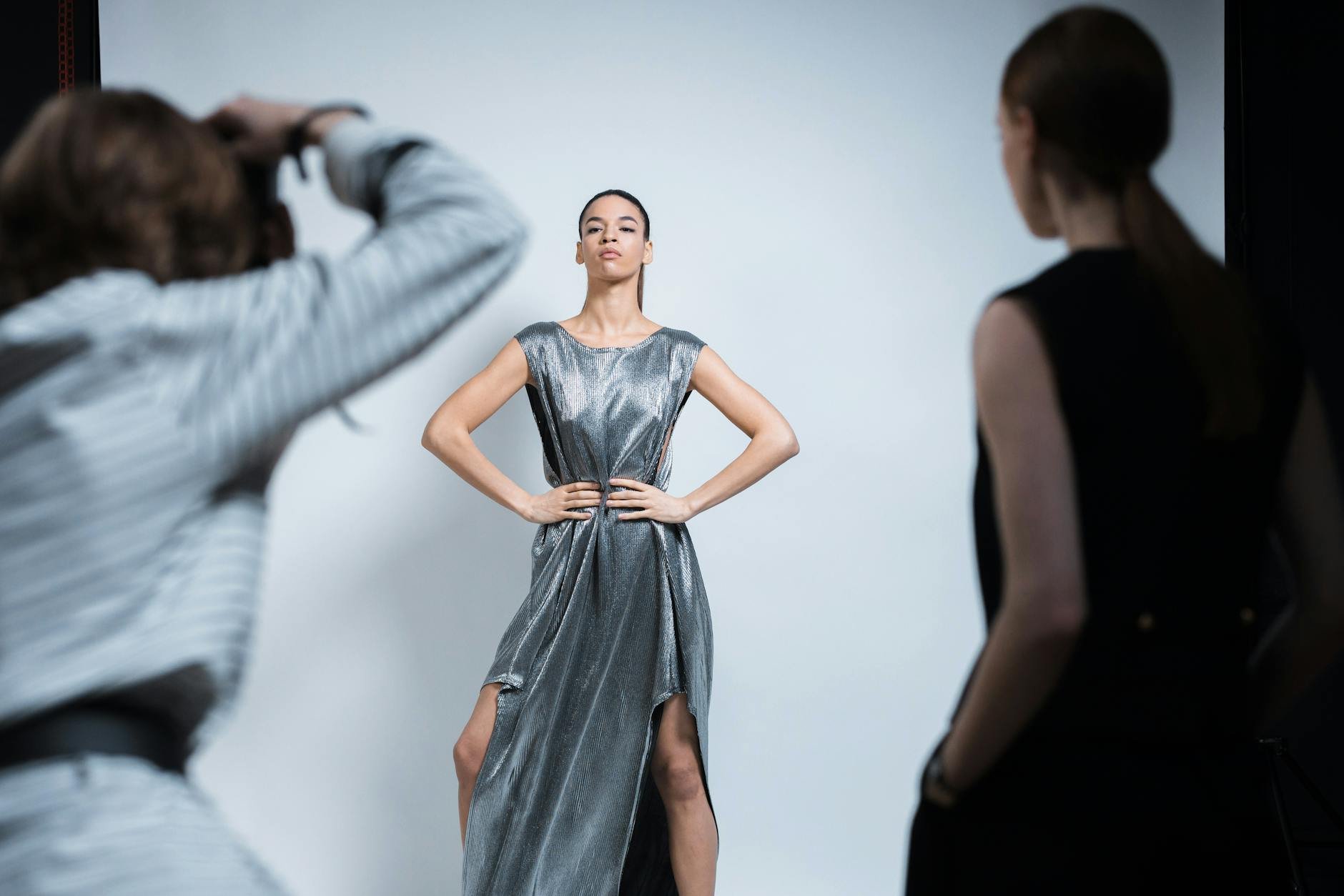
At Dante's Models, we pride ourselves not just on scouting and developing exceptional talent, but also on creating captivating imagery that stands out. Whether it's a model's portfolio, a high-fashion editorial, or a commercial campaign, we understand the power of a distinct visual style. This 70s cyan aesthetic is just one of many looks we can meticulously craft to align with your brand or personal vision.
From the initial concept discussions to the final, polished image, we work collaboratively, ensuring that every detail contributes to the overarching narrative. We’re not just taking pictures; we’re building worlds, one pixel at a time, infusing them with the unique spirit and energy that only New York City can inspire. If you've been dreaming of a photoshoot with a specific aesthetic, perhaps that timeless 70s vibe, or something entirely different, we're here to make it a reality. Our studio in the heart of Manhattan is equipped to handle any creative challenge, and our team of photographers and stylists are experts in bringing visions to life.
Your Turn: Experiment and Create!
Now that you’ve seen the step-by-step process I use to achieve that coveted 70s cyan look, it's your turn to experiment! Don't be afraid to push the sliders, make mistakes, and discover your own unique variations. Photography is as much about personal expression as it is about technical skill. The tools are there; it's how you wield them that makes the difference.
Whether you're a seasoned pro or just starting your journey, playing with color grading is one of the most rewarding aspects of post-processing. It allows you to inject your personality and artistic vision directly into your images. Remember, the goal isn't just to replicate a look, but to understand the principles behind it and then make it your own. Start with a photo you love, perhaps one taken on a bright, sunny day in Central Park or against the graffiti-laden walls of Bushwick, and see what kind of vintage magic you can conjure.
Ready to see how we can bring your vision to life with a professional photoshoot, or perhaps explore more of our creative resources? Visit us at dantet9.com to book a photoshoot or check out our free dantet9.com/tools for photographers and models. Let's create something unforgettable together.
Cover photo by maricabooysen on Pixabay.